The Stocks to Rule them All: Big Tech’s Might in Five Charts
American’s tech giants have caught the public’s attention as of late. Four of the Big Five recently appeared in front of U.S. Congress to discuss their anti-competitive business practices and privacy concerns. Yet business is booming. Compared to the traditional economy, Big Tech operates within an intangible realm of business. This enables them to move faster, cheaper, and more profitably—with business models that possess widespread scale via the internet. The above five charts are a reflection of Big Tech’s momentum and the significant role they have played in the swift and vigorous market recovery. Let’s take a closer look at the data.
Not All Stocks Are Created Equal
Of the 505 stocks that make up the S&P 500 Index, only about a third have experienced positive returns year-to-date (YTD), with the remaining stocks in the red. Despite the majority of companies underperforming, the S&P 500 has generated a positive year-to-date return. This is due to the fact that companies are weighted according to market capitalization. For example, the Big Five now represent 25% of the index, despite being just five of the 505 stocks listed. Big Tech’s dominance is being driven by ballooning market valuations. For instance, Apple reached the $1 trillion valuation in August 2018, and now the company is awfully close to topping the $2 trillion mark after just two years. This is just one of many examples that illustrate the growing power of Big Tech.
Pandemic Proof?
The five Big Tech companies are also seeing business as usual, with revenues in the first half of the year growing steadily compared to the first half of 2019. Their respective stock prices have followed suit, adding to the divergence between the performance of tech and the overall S&P 500 Index. The equal-weighted S&P 500 Index provides diversification, but it has underperformed recently. Year-to-date, the equal-weighted index is down -3.5% relative to the positive 4.5% seen for the S&P 500, a spread of 8%. The combination of Big Tech’s outperformance and large weighting is likely behind the index staying afloat.
Dissecting the Disconnect
You may notice the phrase “stock market disconnect” reverberating recently, reflecting consumer views on the state of financial markets and their relationship with the economy, or lack thereof. While the economy combats record levels of unemployment and a plethora of bankruptcies, major American indexes edge closer to record highs. This disconnect can be explained by the market capitalization weighted qualities of these indexes as well as the geographic source of company revenues in the S&P 500. The most visible businesses to the everyday individual represent a small and vulnerable basket of companies that account for a undersized component of the stock market. No matter how clobbered they get, their effects on the market as a whole are miniscule.
A Global Footprint
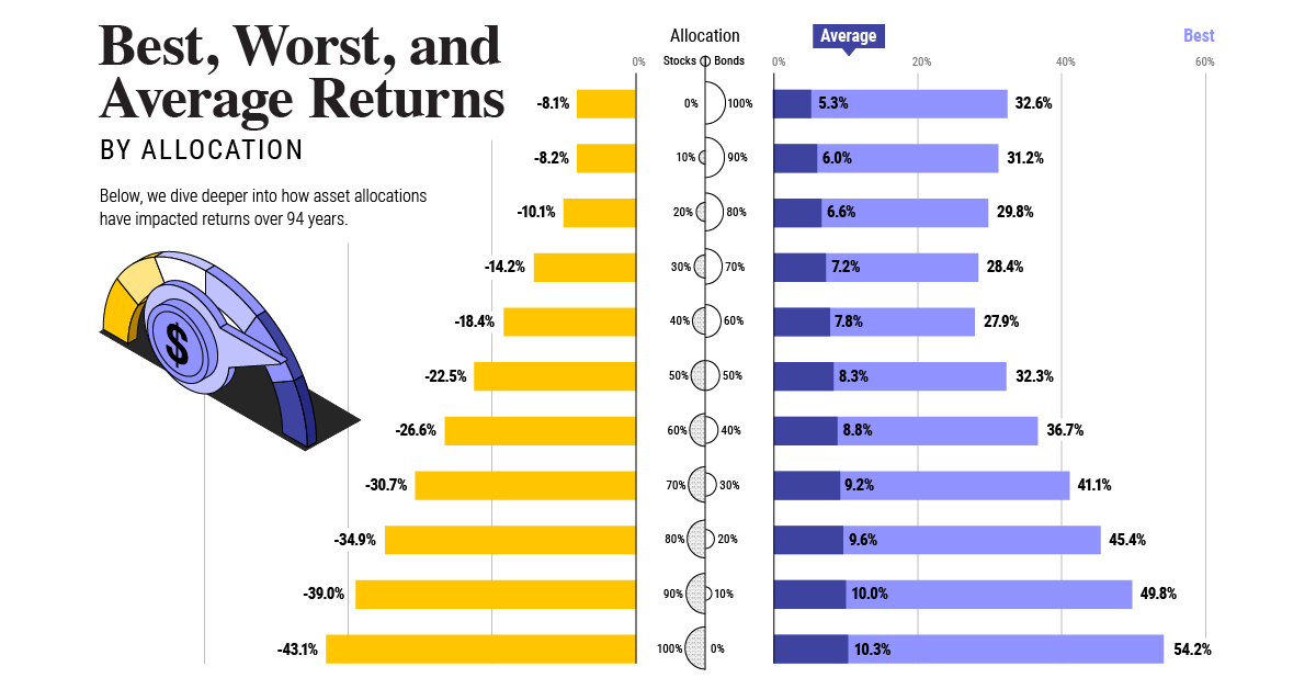
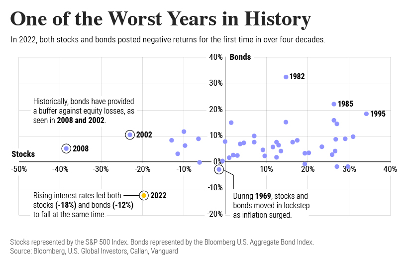
In the era of globalization, American companies are more diversified than ever. Their revenue streams carry a greater global presence, meaning domestic revenues in the United States are less crucial than in times past. For example, the S&P 500’s foreign revenue exposure stands at 42.9% in 2018 and these figures are even higher for Big Tech stocks. Big Tech has outdone itself by virtually any measure. They’ve shown their capacity to translate headwinds to tailwinds, even under challenging economic circumstances. Going forward, estimates by analysts on Wall Street suggest that even more growth for these companies could be on the horizon. on Last year, stock and bond returns tumbled after the Federal Reserve hiked interest rates at the fastest speed in 40 years. It was the first time in decades that both asset classes posted negative annual investment returns in tandem. Over four decades, this has happened 2.4% of the time across any 12-month rolling period. To look at how various stock and bond asset allocations have performed over history—and their broader correlations—the above graphic charts their best, worst, and average returns, using data from Vanguard.
How Has Asset Allocation Impacted Returns?
Based on data between 1926 and 2019, the table below looks at the spectrum of market returns of different asset allocations:
We can see that a portfolio made entirely of stocks returned 10.3% on average, the highest across all asset allocations. Of course, this came with wider return variance, hitting an annual low of -43% and a high of 54%.
A traditional 60/40 portfolio—which has lost its luster in recent years as low interest rates have led to lower bond returns—saw an average historical return of 8.8%. As interest rates have climbed in recent years, this may widen its appeal once again as bond returns may rise.
Meanwhile, a 100% bond portfolio averaged 5.3% in annual returns over the period. Bonds typically serve as a hedge against portfolio losses thanks to their typically negative historical correlation to stocks.
A Closer Look at Historical Correlations
To understand how 2022 was an outlier in terms of asset correlations we can look at the graphic below:
The last time stocks and bonds moved together in a negative direction was in 1969. At the time, inflation was accelerating and the Fed was hiking interest rates to cool rising costs. In fact, historically, when inflation surges, stocks and bonds have often moved in similar directions. Underscoring this divergence is real interest rate volatility. When real interest rates are a driving force in the market, as we have seen in the last year, it hurts both stock and bond returns. This is because higher interest rates can reduce the future cash flows of these investments. Adding another layer is the level of risk appetite among investors. When the economic outlook is uncertain and interest rate volatility is high, investors are more likely to take risk off their portfolios and demand higher returns for taking on higher risk. This can push down equity and bond prices. On the other hand, if the economic outlook is positive, investors may be willing to take on more risk, in turn potentially boosting equity prices.
Current Investment Returns in Context
Today, financial markets are seeing sharp swings as the ripple effects of higher interest rates are sinking in. For investors, historical data provides insight on long-term asset allocation trends. Over the last century, cycles of high interest rates have come and gone. Both equity and bond investment returns have been resilient for investors who stay the course.
